
Archived Content
Information identified as archived is provided for reference, research or recordkeeping purposes. It is not subject to the Government of Canada Web Standards and has not been altered or updated since it was archived. Please contact us to request a format other than those available.
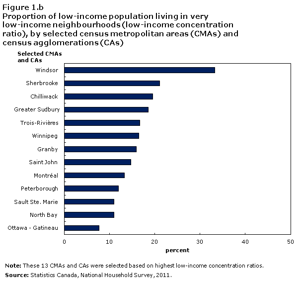
Figure 1.b
Proportion of low-income population living in very low-income neighbourhoods (low-income concentration ratio), by selected census metropolitan areas (CMAs) and census agglomerations (CAs)
Description for figure 1.b
The title of the graph is "Figure 1.b Proportion of low-income population living in very low-income neighbourhoods (low-income concentration ratio), by selected census metropolitan areas (CMAs) and census agglomerations (CAs)."
This is a bar clustered chart.
This is a horizontal bar graph, so categories are on the vertical axis and values on the horizontal axis.
There are in total 13 categories in the vertical axis. The horizontal axis starts at 0 and ends at 50 with ticks every 10 points.
There are 1 series in this graph.
The horizontal axis is "percent."
The vertical axis is "Selected CMAs and CAs."
The title of series 1 is "Proportion."
The minimum value is 7.7 and it corresponds to "Ottawa - Gatineau."
The maximum value is 33.3 and it corresponds to "Windsor."
| Selected CMAs and CAs | Low-income concentration ratio (percentage) |
|---|---|
| Windsor | 33.3 |
| Sherbrooke | 21.1 |
| Chilliwack | 19.5 |
| Greater Sudbury | 18.6 |
| Trois-Rivières | 16.7 |
| Winnipeg | 16.5 |
| Granby | 15.9 |
| Saint John | 14.7 |
| Montréal | 13.3 |
| Peterborough | 12.0 |
| Sault Ste. Marie | 11.0 |
| North Bay | 11.0 |
| Ottawa - Gatineau | 7.7 |
Note: These 13 CMAs and CAs were selected based on highest low-income concentration ratios.
Source: Statistics Canada, National Household Survey, 2011.
- Date modified: